Why a Matte Wall and Glossy Trim Read Differently
See why a matte wall and glossy trim read differently, and choose paint sheen to control colour depth, reflected light and visible surface detail.
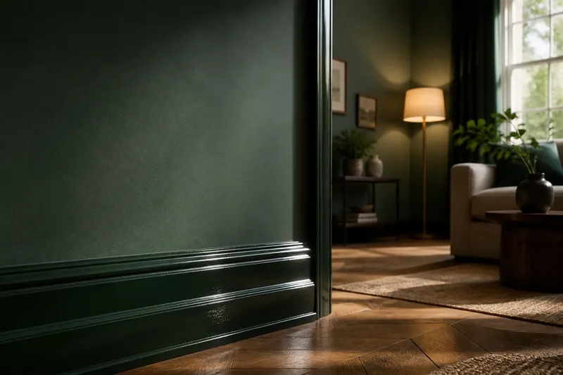
You brush a sample of deep green onto the wall, then paint the skirting beside it in the same colour. By morning, the wall looks soft and nearly still, while the trim seems brighter and more distinct. That change is not a trick of the pigment: a matte wall and glossy trim read differently because their surfaces handle light in different ways.
Sheen is the amount and character of light a painted surface reflects. Matte finishes scatter light across a broad, soft area; glossier finishes reflect it more directly, like a sheet of glass catching a lamp. The paint colour may be identical, but the reflected light can make one area appear deeper, cleaner, sharper or more noticeable.
That difference is useful when it is deliberate. It can also make a carefully chosen colour look inconsistent, call attention to surface flaws or produce a sharp trim line that feels too prominent. Diagnose the visual problem first, then adjust the finish, the lighting conditions or the painted surface in a sensible order.
When the same colour looks lighter on the trim
A glossy trim can look lighter or more saturated than a matte wall, particularly where it catches a window or a bare bulb. The wall spreads incoming light, so its colour tends to look quieter. The trim sends more light back towards the room in a defined reflection, which can make the colour feel more vivid.
This is not a dependable rule that every gloss finish will look lighter. The result depends on the paint colour, the direction of the light, the viewing angle and the exact sheen. A dark colour may look especially rich in a shaded matte area and strikingly bright where gloss catches a highlight; a pale colour may simply look crisper along the woodwork.
What to try, in order: Look at the wall and trim from the usual doorway and seating positions, not only from directly in front. Check them in daylight and with the room’s normal lamps on. If the trim looks too bright, try a lower sheen on a sample panel before changing the colour. If you want the trim to stand out, retain its gloss but consider whether the contrast is clearest in the places where light falls.
Imagine you have painted a blue-grey wall and its skirting in the same colour, but the skirting flashes pale whenever a floor lamp is on. You could make an invented sample on a spare board in satin rather than gloss and place it beside the wall. The expected observable result is a softer highlight and a less abrupt shift, while the trim still has more definition than the wall.
When reflections make a room feel busy
A reflective finish can pick up bright windows, lamps and moving shapes. On a long run of trim, repeated highlights may draw the eye along the room; on a broad panel or door, reflections can compete with the colour itself. The effect may be pleasant on a small detail and distracting on a large, exposed surface.
First identify the source of the strongest reflection. Stand where you usually enter the room and notice whether the shine comes from a window, a ceiling light or a lamp placed close to the painted surface. Then look from another angle. If the bright patch shifts or disappears, the finish is reflecting its surroundings rather than changing colour uniformly.
Try changing the bulb’s position or shade, or move a portable lamp so its beam does not strike the trim directly. If the reflection remains intrusive, choose a lower sheen for the next coat or repainting project. Avoid judging a finish from a small flat sample alone: a narrow sample can miss the long, continuous highlight that appears on a full door frame.
Some reflected light is part of the point. A crisp gloss line can define a door casing against a quieter wall, and a little shine can keep a dark-painted detail from seeming flat. The aim is not to eliminate every highlight, but to decide whether it should lead the eye or stay in the background.
When the finish exposes dents, brush marks or unevenness
Gloss tends to make surface changes easier to see because its clear reflections bend around ridges, dents and uneven joins. Matte paint scatters light more broadly, so small variations may be less conspicuous. Neither finish repairs the material beneath it: a glossy coat can make a well-prepared surface look crisp, but it can also emphasise rough sanding or old brush marks.
Before choosing a sheen, inspect the trim in raking light. A torch held close to the surface can reveal raised grain, filler edges and dried drips that are hard to spot under overhead lighting. If the surface is uneven, prepare it appropriately before painting, or select a less reflective finish if a softer appearance suits the room.
Do not try to disguise every flaw by adding another coat of glossy paint. More paint can leave visible runs or build-up around corners, while the underlying defect remains. For routine decorating, follow the paint maker’s preparation and application directions; for extensive damage or uncertain repairs, ask a qualified decorator to assess the surface.
Matte is not automatically the best option for every imperfect surface, either. A broad matte wall can show scuffs or polished patches from repeated contact, depending on the product and use. Consider the surface’s condition alongside how much handling it receives, rather than treating sheen as a substitute for preparation.
When a sample looks right but the finished room does not
A small colour card rarely shows how sheen behaves across a wall or a length of woodwork. Its limited area catches little reflected light, and it may be viewed at a different angle from the finished surface. A sample painted on a vertical board gives a more useful comparison, especially if it can be moved between the wall, the trim and the light sources in the room.
Compare finishes on the same colour and, where possible, on matching sample areas. Keep the samples beside one another rather than relying on memory. Look at them from the room entrance, near a window and from the place where you spend most time. Notice the colour itself, the brightness of the reflection and how strongly the edge between surfaces reads.
Let the paint dry as directed before making a decision. Wet paint can look different from its dried finish, and a sample that has not dried evenly may give a misleading impression. Use the same lighting you expect to have in the room, but do not arrange the lamps solely to flatter the sample if the room will normally be used another way.
If the colour seems to change dramatically only at certain angles, the issue is likely to be the reflection rather than a poor colour match. Decide whether that changing effect adds useful depth or creates a distraction. A lower sheen can make the colour read more consistently across the surface; a higher sheen can make changes in light part of the visual character.
When the wall and trim look disconnected
Using one colour across wall and trim does not automatically create a seamless effect. A high-sheen border can form a bright outline, while a matte wall absorbs more of the light. The eye reads both the change in surface and the boundary between them, so the trim may appear to be a separate band even when its pigment matches.
If you want a quiet, continuous look, compare a lower-sheen trim with the wall colour, or choose a trim colour close to the wall rather than identical to it. A small difference in colour can sometimes look more intentional than a nominal match that becomes conspicuous under gloss. If you prefer definition, keep the sheen contrast and make sure it is repeated consistently around doors, skirting and other painted details.
Check corners and meeting points before settling on the combination. A change in sheen can look especially sharp where a narrow trim meets a broad, uninterrupted wall. Consider the visual weight of the trim as well as its colour: a glossy edge may draw attention to its shape, while a softer finish can let the wall colour dominate.
Which sheen suits a wall or trim?
Does glossy paint always look lighter than matte paint?
No. Gloss often creates stronger highlights, which can make a colour appear brighter in some places, but the effect varies with the colour and the light. Compare the actual finish in the room rather than assuming a fixed light-to-dark shift.
Should wall and trim paint have different sheens?
They can, if you want the wall to feel quiet and the woodwork to read as a defined edge. Use similar sheens when you want less contrast, or retain a clearer difference when the trim’s outline is part of the room’s character.
Which finish is better for hiding an uneven surface?
A less reflective finish usually draws less attention to small surface variations, while gloss can make ridges and dents more visible. Preparation still matters, and the most suitable finish also depends on the surface’s use and the paint product.
How can I compare sheen before painting the whole room?
Paint samples of the same colour on separate boards, let them dry as directed, then view them beside the intended wall and trim. Check them from several positions in both daylight and the room’s usual artificial light.
Choose the highlight you want to see
Think of sheen as the difference between a piece of unglazed pottery and a glazed one: the material can carry the same colour, yet the glazed surface catches a sharper gleam. A matte wall with glossy trim uses that contrast to separate broad planes from edges, but it is only one option.
For a subdued room, keep the sheen change modest and let the colour do more of the work. For a room where painted woodwork should stand out, use a more reflective trim and check where its highlights fall. A sample viewed in the room’s ordinary light is the clearest way to judge whether the effect suits your space.
When choosing a matte wall and glossy trim, focus on the actual highlight, not the label alone: does it clarify the room’s edges, or pull attention to an unwanted reflection? Answering that question gives you a practical reason to keep, soften or increase the sheen contrast.