The Gallery Wall Mistake: Treating Every Frame as a Solo Act
A gallery wall visual link helps varied art feel connected without matching every frame. Choose a frame, colour or spacing cue that suits your collection.
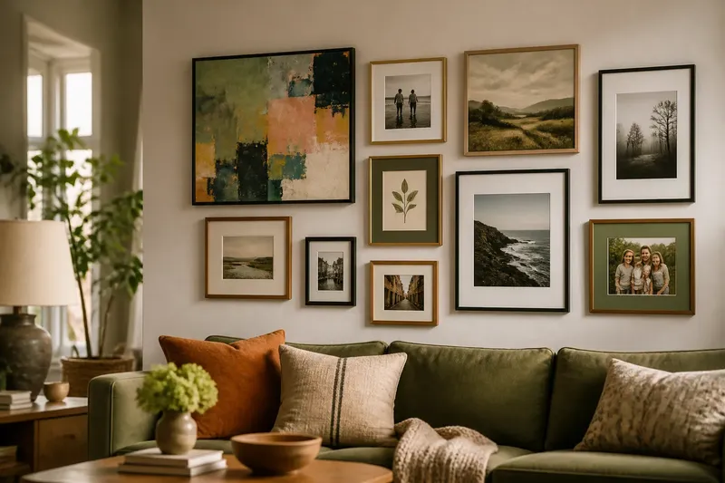
You hang a bold landscape above the sofa, then add a bright portrait beside it; soon every frame seems to demand the same attention. A gallery wall visual link can bring varied pieces together without making them match.
Build on what the collection already shares
Lay the frames on the floor or tape paper templates to a plain wall. Look for a feature that already recurs: dark outlines, a colour in several pictures, similar shapes or a natural rhythm in the gaps. Work with that feature rather than introducing a new theme that competes with the art.
The link need not appear in every piece. Ochre might recur in a print, a small painting and a photograph’s mount, while cooler pictures add contrast. Think of it like a button repeated on a coat: a small detail can make separate parts feel related without making them identical.
Choose the approach that suits the artwork
Use frames to create a steady rhythm
Repeat a frame finish, such as black or pale oak, while letting the pictures vary. This works well when subjects and palettes differ, and makes it easier to add new prints later. Vary scale and orientation to avoid an overly formal result; a simple drawing can offer a visual pause between busier works.
Use colour to connect varied frames
Repeat a colour already present in the artwork, leaving frame materials and finishes alone. This can preserve the character of collected or inherited frames. View the group from across the room: a tiny detail may disappear, while a large vivid patch may take over. Choose a colour that can be noticed without becoming the main subject.
Use spacing to give the group structure
Keep the gaps between frames consistent when the artwork feels related but the frames do not. Even spacing gives the eye a calm route around the display. It may not be enough when one image feels much darker or busier than its neighbours; move that piece towards an outer edge or place a quieter work between it and a pale, simple picture.
Which gallery wall visual link fits your collection?
What if the artwork has very different colours?
Use frame finish or the gaps between pictures rather than trying to make the artwork match. A repeated edge can connect a bright poster, a subdued landscape and a monochrome photograph while preserving their separate palettes.
Can every frame be different?
Yes, if another feature recurs clearly, such as a colour or a consistent gap. Keep an unusual frame away from several other strong details so it reads as an accent rather than the start of a competing arrangement.
How can I keep the wall from looking too uniform?
Repeat one feature and let others vary. Mix scale, subject, orientation or frame material, and avoid aligning every edge unless a more ordered display suits the room.
Should the arrangement be symmetrical?
Symmetry can suit similar works or a room that calls for a composed focal point. For a looser arrangement, balance visual weight instead: set a broad or dark piece against a cluster of smaller, lighter works.
Judge the arrangement from the doorway and sofa
Stand where you normally enter or sit. Notice which picture catches your eye first and whether the group feels crowded or disconnected. If several pieces compete, choose a quieter frame or spacing approach; if the works feel unrelated, make a colour or shape that is already present easier to see.
Imagine you have a vivid abstract print, two family photographs in different frames and a small botanical drawing. On the floor, you notice muted green in the abstract and botanical picture. You keep the frames varied, place the drawing between the photographs and the print, and choose a green mount for one photograph. From the sofa, the repeated colour gives the arrangement a visible thread; the trade-off is that the green mount becomes more noticeable than the original plain one.
Try covering one frame at a time with plain paper. If the connection vanishes when one particular picture is hidden, add a subtle recurrence elsewhere, such as a matching mount or frame finish. If the remaining group still reads as related, let that picture act as an accent.
Settle the layout before putting hooks in the wall
Use paper templates to mark the outside edges and planned gaps. Step back from the doorway and the main seat, then check these points:
- Observe whether the shared frame finish is visible across the group; if it is, keep it as the link, otherwise add another matching edge or choose a colour cue.
- Observe whether a repeated colour can be seen from the usual seat; if it can, retain it, otherwise use a clearer colour detail or rely on frames.
- Observe whether the gaps look even; if they do, keep the spacing, otherwise adjust the templates before hanging.
- Observe whether one dark or busy picture dominates; if it does, move it towards an outer edge or place a calmer work beside it.
- Observe whether the group feels too uniform; if it does, vary picture size, orientation or frame material while retaining the chosen connection.
- Observe whether the composition feels balanced from the doorway; if it does, mark the template positions, otherwise rearrange the heavier-looking pieces before choosing fixings.
Begin with the largest or most visually weighty work, then arrange the others around it. Check the wall surface and follow the frame and hanging hardware instructions; seek qualified help if the installation raises a safety concern. Once the display is up, make small adjustments only after seeing it in the room. A picture that looked awkward on the floor may sit naturally against the wall.